Blank Mobile App Design
Blank: Your ultimate night-hopping app, is a nightlife directory targeted towards millennial users. By telling the app what you’re looking for, it fills in the blank. My role in this conceptual project was to solve a problem for a target audience, conduct user research, and design a mobile app interface.

Is there a better way to figure out what to do on a Friday night?
Inspired by my experience in Seoul, South Korea, where nightlife is a large part of the social culture, I wanted to create an app that would be engaging for a millennial audience that would solve the pain-point of trying out new, local establishments without risking it not being up to your personal taste. Blank allows users to harness word-of-mouth and quick reviews to conveniently pinpoint an establishment that meets their own specific criteria of Atmosphere, Mood, Price Point, and Crowd Size.

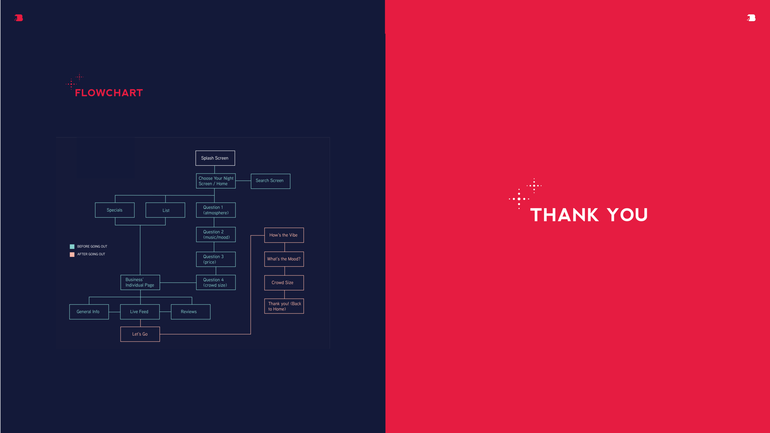
App features: Questionnaire
The app’s main feature is to gain a customized result based on atmosphere, music, price, and crowd-size by filling out a simple questionnaire. This sets Blank apart from other directories by providing easy, quick, and live feedback from users at an establishment.

Design Considerations
Targeting a millennial audience and users from age 21-50 years old, I focused on creating a modern, vibrant, colorful interface that engaged users and prioritized only the important information on each screen.

Making leaving Quick Feedback less of a hassle
After being matched, offer quick feedback on a establishment by filling out a short questionnaire when you arrive to contribute to the app’s function.

leave a review
Participate in the Live Feed or leave a review for others to see.
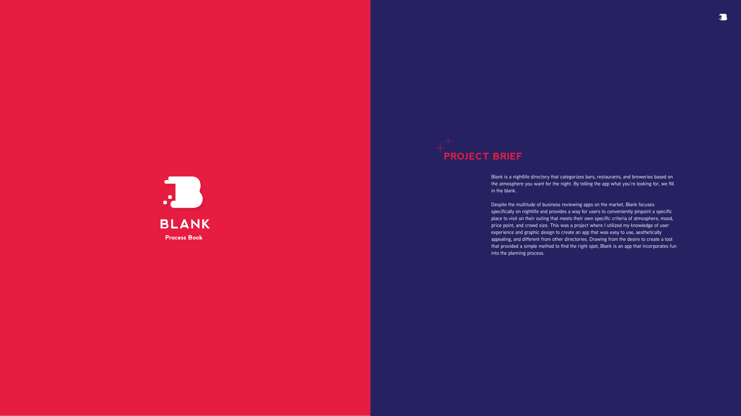
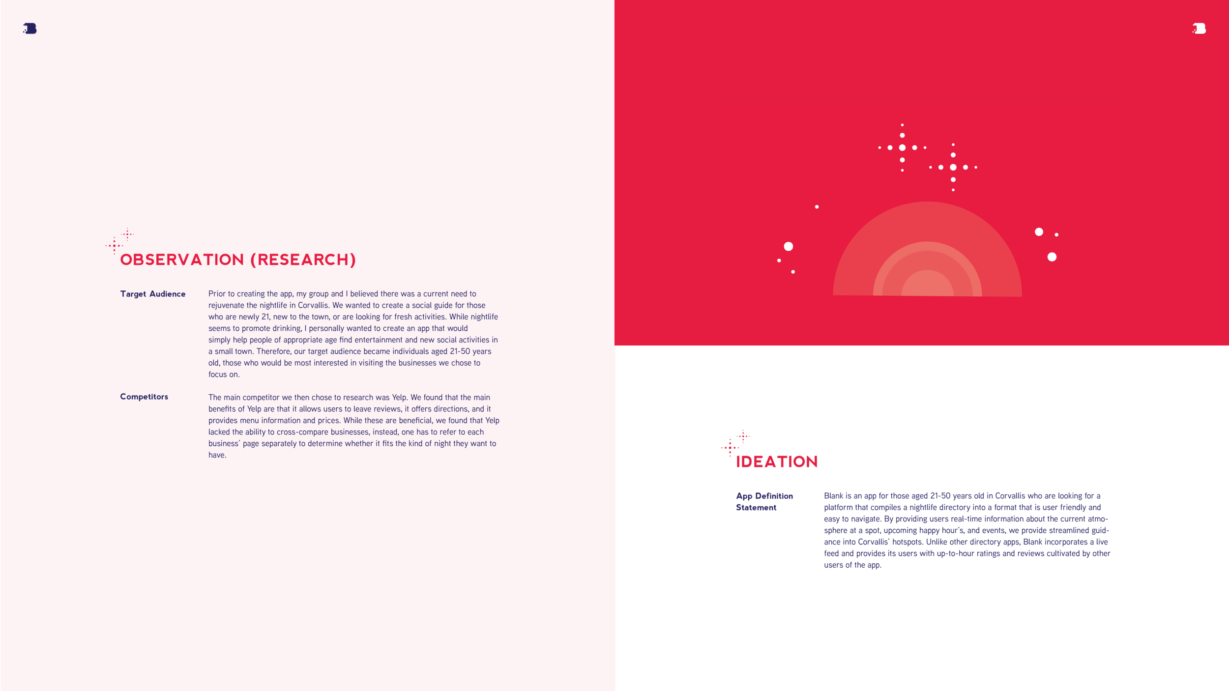
Blank Process Documentation
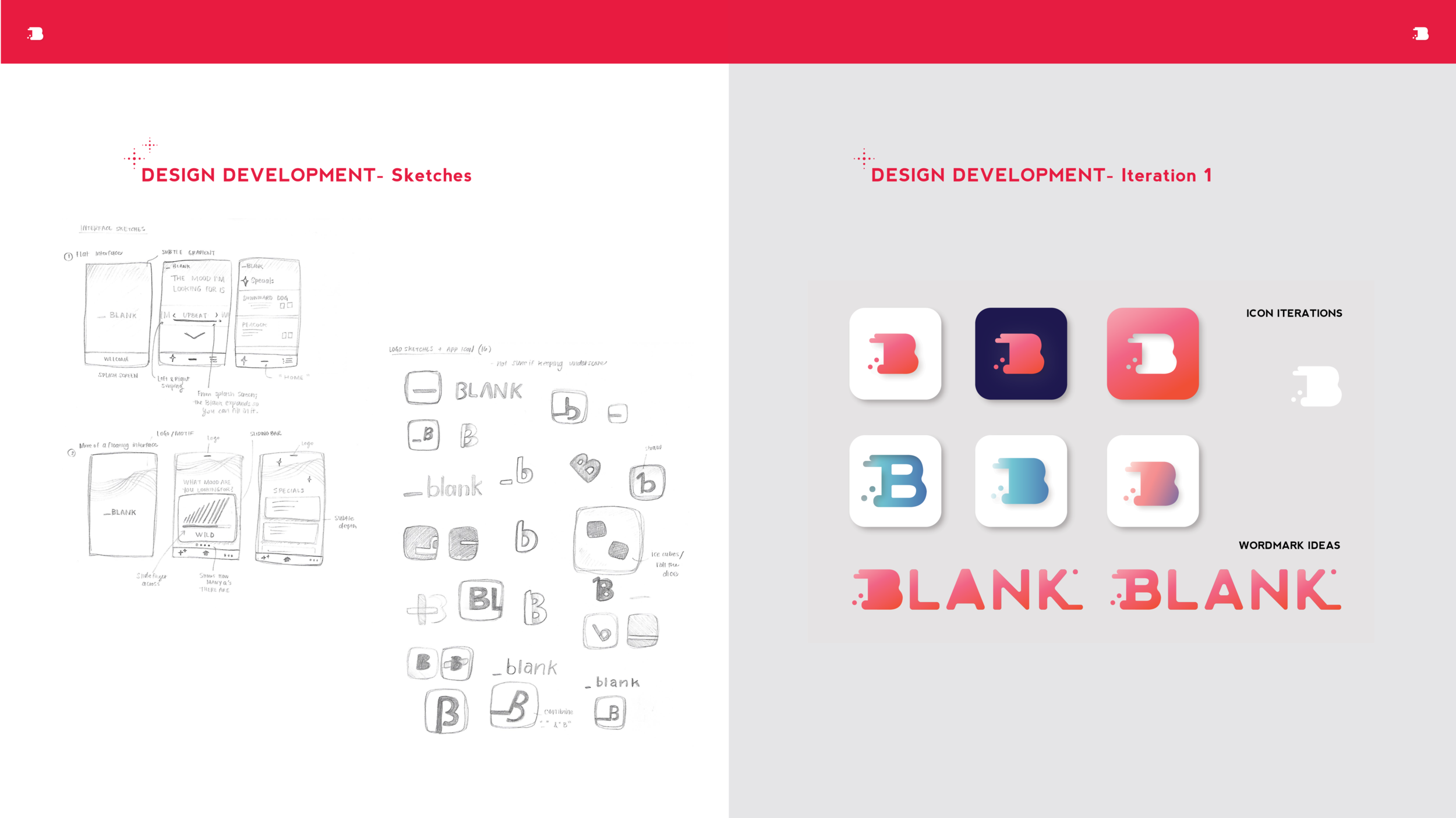
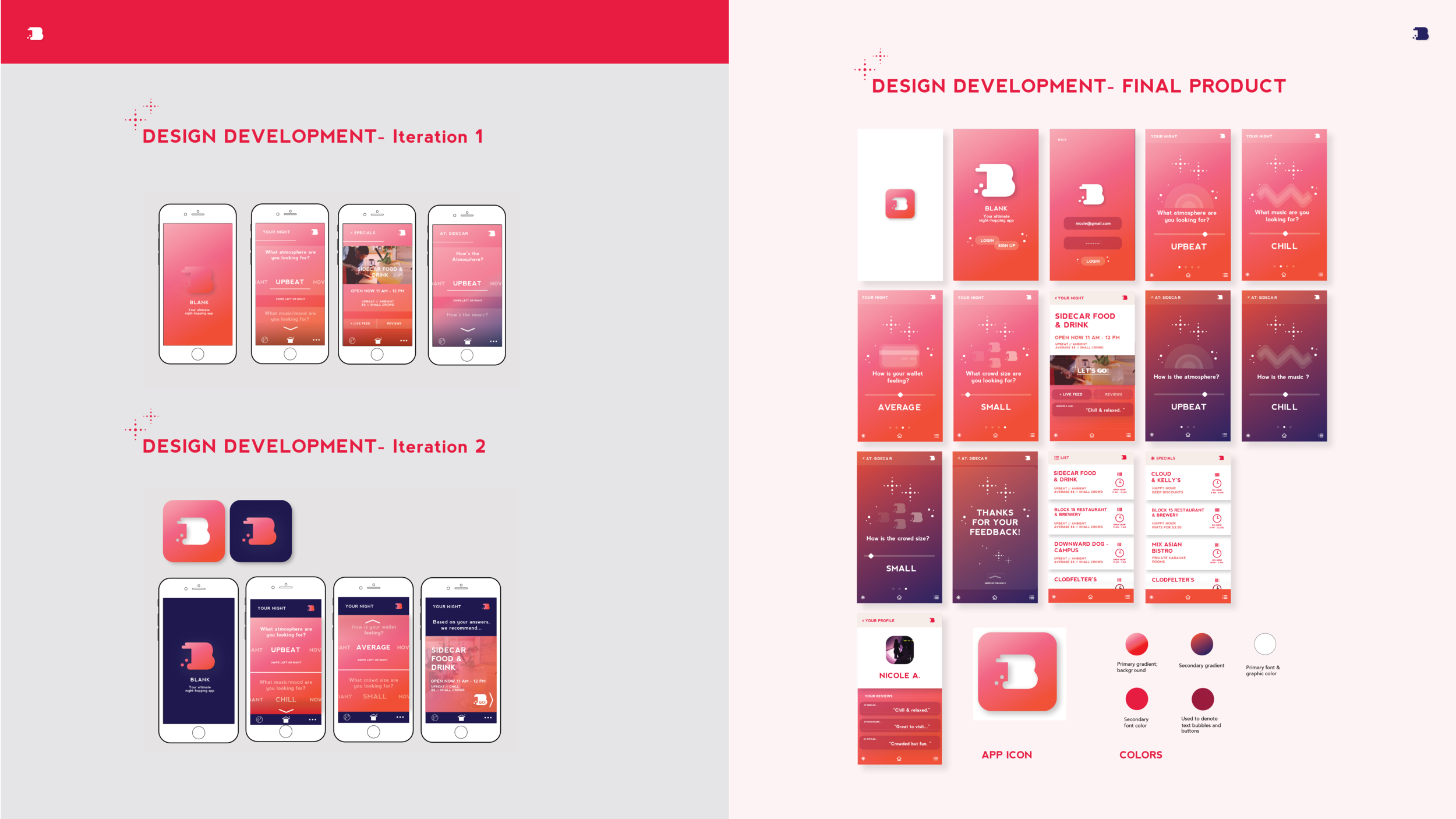
Design sketches & iteration
Inspired by the letter B and the concept of “night-hopping” the logo is meant to resemble a rabbit in motion. I chose the gradient to reflect the modern styling of apps like Spotify and Instagram which feature subtle gradients in their logo design.
